 Hestory
 How much does branding cost in the UK?
 Men from Mars
Brand identity
Starbucks Drops the Words: What Its 2011 Logo Change Shows About Growing Beyond Your Name
In 2011 Starbucks removed ‘Starbucks Coffee’ from its logo to leave room to grow. What the change shows about names, symbols and brand stretch.
Starbucks’ 2011 logo change is a useful case for any business that expects to grow beyond what its name describes. By dropping words from the logo, the company gave itself room to move, while keeping what customers already recognised.
In this article
What happened
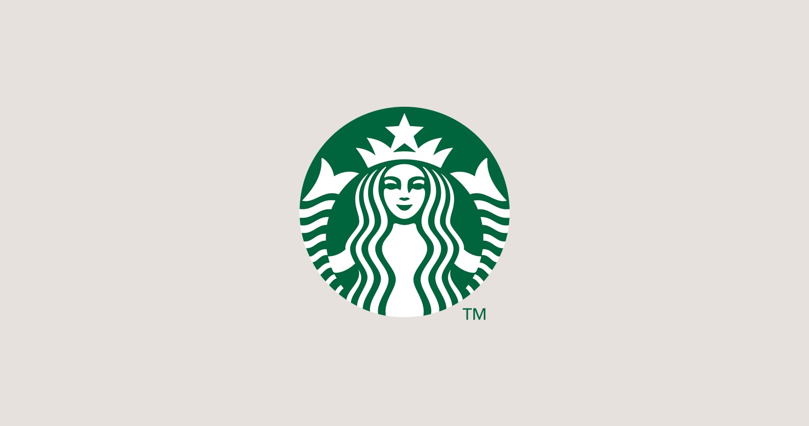
According to CNN Money, Starbucks unveiled its wordless logo on 5 January 2011, marking its 40th anniversary. The siren was lifted out of the green circle and the words “Starbucks Coffee” were removed. Design firm Lippincott worked with the in-house team on the update.
Chief executive Howard Schultz tied the change to growth beyond coffee. He said the siren could come out of the circle in a way that gave the company “the freedom and flexibility to think beyond coffee”, while stressing that Starbucks would remain a coffee company. Wharton commentary noted another benefit: with no words, the logo avoids translating the name into other languages in new markets. Reaction was mixed, with some people unhappy and others praising the simpler look.
Why it matters
- Names can limit you. “Coffee” in a logo points at one product. When a brand grows, the label can hold it back.
- Symbols travel. A mark without words works in any language.
- Recognition comes first. The siren had been on cups for decades, so people already knew it.
- Timing helps. An anniversary gave the company a natural reason to change.

Questions to ask your own brand
- Does our name or tagline describe only one thing we do? If we expand, will it still fit?
- Do people recognise our symbol without the words? Try the memory test in our guide to the Instagram icon redesign.
- Are we ready to be known for more than our first product?
- Would a descriptor (a line under the name) solve the problem more safely than dropping words?

The safe route to flexibility
Few businesses have Starbucks’ recognition. A safer option is to keep your name and use a separate descriptor that can change as you grow. That way you can move from “Smith’s Bakery” to a wider range without a full rebrand. Our guide to brand architecture explains how names and offers fit together, and our naming guide helps if you are choosing a name that will last.
Related reading
Compare this story with Mastercard dropping its name and, for a heritage brand, Pepsi’s return to the globe.
If you’re planning to grow and want your brand to stretch with you, book a free brand consultation.
Sources
- Starbucks unveils a new logo, CNN Money
- Logo overhaul: will customers still answer the siren call of Starbucks?, Knowledge at Wharton
Cover photo by Kelly Sikkema on Unsplash.