
 Hestory
 How much does branding cost in the UK?
 Men from Mars
News
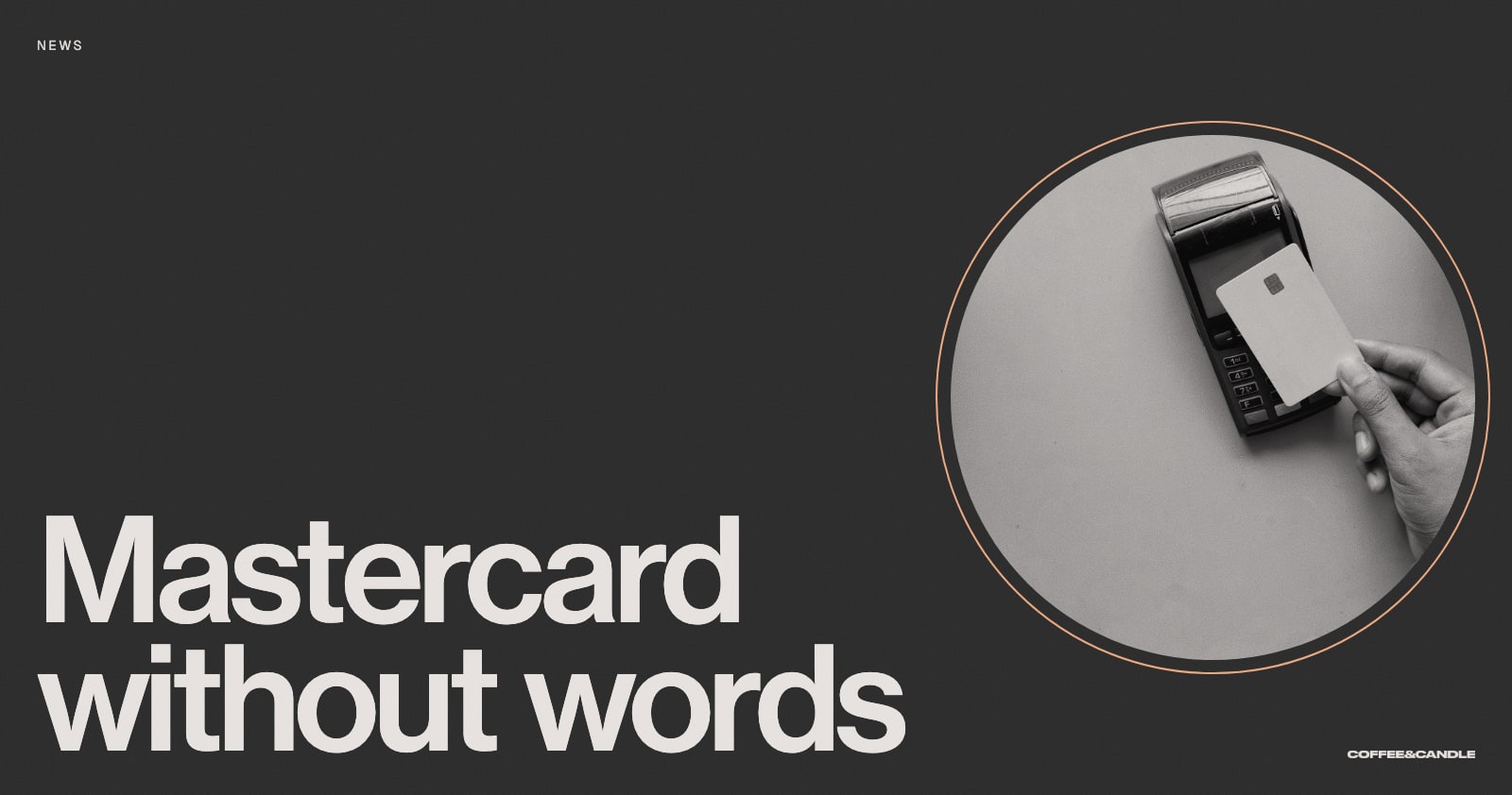
Mastercard Drops Its Name: When Can a Brand Go Wordless?
Mastercard removed its name from its logo in 2019 after research showed people knew the symbol. What it takes for a brand to earn that freedom.
In January 2019, Mastercard announced it would drop its name from its logo in many places and let two interlocking circles do the work. Few brands can do this safely. The story shows what it takes to earn it.
In this article
What happened
Mastercard announced the change at CES in Las Vegas on 7 January 2019, according to its own press release. The design work was by Pentagram, led by partner Michael Bierut. The red and yellow circles, which Mastercard calls the Mastercard Symbol, would now appear without the wordmark on cards, on acceptance marks in shops and online, and at major sponsorships.
The reason was recognition. The company said research showed that more than 80 percent of people spontaneously recognised the symbol without the word, according to chief marketing officer Raja Rajamannar. Dezeen reported that Pentagram compared the move to brands such as Apple, Target and Nike that people can identify by symbol alone. It followed Pentagram’s 2016 update, and the full name still appears in some places.
Why it worked
- Years of use. The circles had been in front of people for decades.
- Consistent use. The same symbol, in the same colours, in the same places.
- Evidence. The decision followed research on recognition rather than a hunch.
- A staged change. The name was dropped only where it was safe to do so.
- A practical reason. Symbols travel better across languages and fit small screens.


Can your brand go wordless?
Probably not yet, and that’s fine. A wordless logo is a reward for years of consistent exposure. Before you consider it, ask:
- Would people recognise the mark without the name, and how do you know? Try the test in our guide to the Instagram icon redesign.
- Is the symbol distinctive, or could it belong to any brand in your category?
- Is it used consistently everywhere?
- Will the name still be visible where people first meet you?

For most small and growing brands, the name is the asset to build. People can’t recommend a mark they can’t say. See our guide to logo versus brand identity for what each does.
What to do instead
Build recognition with consistency: one colour, one typeface, one way of speaking, used everywhere. Our guides to brand consistency and brand guidelines show how. When the time comes to simplify, you’ll have the evidence.

If you would like help with this, book a free brand consultation.
Sources
- Mastercard evolves its brand mark by dropping its name, Mastercard
- Mastercard drops its name from logo in subtle refresh of Pentagram redesign, Dezeen
Cover photo by Towfiqu barbhuiya on Unsplash.