 Hestory
 How much does branding cost in the UK?
 Men from Mars
Brand identity
Burberry’s Logo Journey: From Monogram Back to the Knight
Burberry changed its logo in 2018 and returned to its Equestrian Knight in 2023. What the reversal says about heritage, creative leadership and brand equity.
Burberry changed its logo in 2018 and brought back an older symbol in 2023. The two moves show how a fashion house can use identity to signal a new direction, and how heritage can return when a brand wants to reconnect with its roots.
In this article
What happened
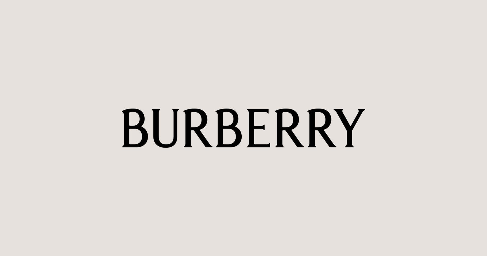
In August 2018, a few months after Riccardo Tisci became chief creative officer, Burberry unveiled a new logo and monogram, according to Dazed. It was the brand’s first new logo and monogram in around two decades. The monogram interlocked the letters T and B, honouring founder Thomas Burberry, and was designed with the British art director Peter Saville. The name was set in a bold, modern sans-serif.
In February 2023, under chief creative officer Daniel Lee, Burberry brought back the Equestrian Knight Design. Design Week reported that the knight, based on a winning entry in a public competition around 1901, returned with the added Latin word “Prorsum”, meaning “forwards”. The wordmark moved to a serif typeface, away from the sans-serif Saville had designed four years earlier. The first Lee campaign appeared two weeks before his debut show.
What the story shows
- Identity can signal a new chapter. Both changes arrived with a new creative leader and told the audience that something was different.
- Heritage is a resource. The knight was already part of the brand’s history, so bringing it back felt authentic.
- Not every change lasts. A bold new look is a bet. If it doesn’t resonate, brands can change course.
- Systems matter. The logo, check pattern, type and campaign were treated as one story.
- Timing and teasing build interest. A campaign before the show built anticipation.
What smaller brands can learn
- Link identity changes to real change. A new look should reflect a new direction in products, people or approach, not just a new fashion.
- Mine your own history. A past logo, label, pattern or founder story may be your strongest asset. See Pepsi’s return to the globe.
- Think about leadership change. When a new person takes over, a brand review is a sensible step. Our guide to running a brand audit can help.
- Be ready to adapt. Test early and be open to changing what doesn’t work. See how to test a rebrand before you launch it.
- Do not be driven by trends alone. Look for what is true about your brand.

A note on sources
Some details, such as exact appointment dates and colour descriptions, differ between reports, so I have kept to the points on which they agree.
If you’re rethinking your brand after a change in leadership or direction, book a free brand consultation.
Sources
- Burberry unveils its new logo and monogram, Dazed
- Burberry reverts to its roots under new creative officer Daniel Lee, Design Week
Cover photo by Masha Kotliarenko on Unsplash.