 Hestory
 How much does branding cost in the UK?
 Men from Mars
Brand identity
Airbnb’s Bélo: What a Symbol Anyone Can Draw Teaches Us About Brand Design
Airbnb’s 2014 Bélo symbol was designed to be drawn by anyone and to stand for belonging. What the project teaches about concept-led identity.
Airbnb’s 2014 rebrand is often cited for its logo, but the bigger lesson is how the logo came from an idea. The team started with what the company stands for and then designed a symbol for it. That order is worth copying.
In this article
What happened
In July 2014, Airbnb unveiled a new identity created with the London agency DesignStudio, according to Dezeen’s report. It replaced the identity the company had used since 2008 and covered a new logo, visual identity and website. Airbnb’s graphic design lead Andrew Schapiro said the old identity “didn’t capture what Airbnb is”.
Design Week reported that DesignStudio was one of 35 consultancies considered and beat other shortlisted groups after building an Airbnb listing in its own office for the pitch. The team then worked from inside Airbnb’s headquarters, and members travelled and stayed in Airbnb accommodation to see the experience from both hosts’ and guests’ sides.
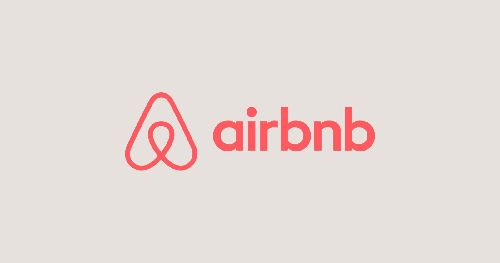
The idea was “belong anywhere”, and the symbol, called the Bélo, was designed around it. It combines a person with raised arms, a location marker and an upside-down heart, so it stands for people, places and love, and it also resembles the letter A. It was built so anyone could draw it, and the company offered a tool for hosts to customise their own version.
Lessons for your own brand
- Start with an idea, not a shape. “Belong anywhere” gave the designers a clear test for every decision.
- Do the field research. Staying in listings gave the team real insight, not guesses.
- Design for imitation. A symbol that people can sketch is easy to remember and share.
- Make it flexible. Letting hosts customise the mark gave the community a part in the brand.
- Keep it simple. A plain typeface helped people unfamiliar with Roman letters read the name.
- Build the system, not only the logo. The rebrand reached the website and the whole experience.


What this means for a smaller brand
You may not be able to stay in every one of your customers’ homes, but you can listen to them. Our guide to brand strategy shows how to find your core idea, and a positioning statement turns it into a sentence your team can use. Only then does it make sense to design the symbol. Our brand identity guide takes you through the steps.

One caution
Different sources describe the symbol’s meanings slightly differently, so treat the exact count of ideas as a detail. The principle is the same: the mark carries a meaning that the company can explain in a sentence.
If you want to find the idea at the heart of your brand, book a free brand consultation.
Sources
- Airbnb rebrand by DesignStudio aims for visual consistency, Dezeen
- DesignStudio creates ‘symbol of belonging’ for Airbnb rebrand, Design Week
Cover photo by Prydumano Design on Unsplash.