Packaging Design Examples: What Makes Great Packaging Work (and What to Learn From It)
Looking at good packaging is useful only if you understand why it works. The best examples share a handful of principles that apply to any product, from a drink to a candle to a skincare range. This article describes those principles, with examples of well-known packaging and our own work.
Descriptions of other companies' packaging are our own observations and are not endorsed by or connected with them.
1. A shape people recognise
Some packaging is so distinctive you can recognise it by silhouette alone. The classic Coca-Cola contour bottle, introduced in the early twentieth century, was designed to be recognisable even by touch or when broken. The Marmite jar's shape does a similar job.
Principle: structure is a brand asset. If the budget allows, a distinctive shape can be more memorable than any graphic.
2. A voice on the pack
Innocent Drinks became known for a conversational tone on its bottles, and Oatly for a blunt, witty voice on its cartons. The packaging does more than carry information, it sounds like a person.
Principle: copy is part of design. A consistent tone of voice turns a pack into a conversation.
3. A story you can see
Tony's Chocolonely uses an unequally divided chocolate bar to point at inequality in the cocoa industry. The product itself makes the point.
Principle: if your brand has a belief, look for a way to show it, not just state it.
4. A clear hierarchy
Strong packs make three things easy to find: the brand, what the product is and the main reason to buy. Everything else supports them.
Principle: decide what matters most and give it the most space. Crowded packs lose on shelf and on screen.
5. A system, not a one-off
Good ranges feel related. Colour coding, a consistent grid and repeated devices let customers find a flavour or a variant quickly.
Principle: design the range before you design the first pack. See our packaging design process.
6. The unboxing as part of the brand
For online products, the box is the first thing a customer touches. Careful materials, a message inside and a pleasing opening sequence turn delivery into a brand moment.
Examples from our own work
Men from Mars
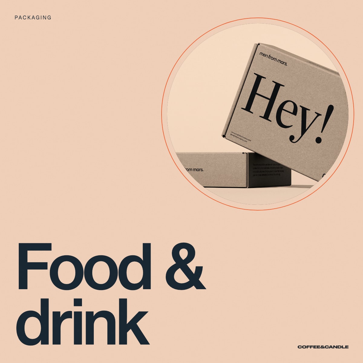
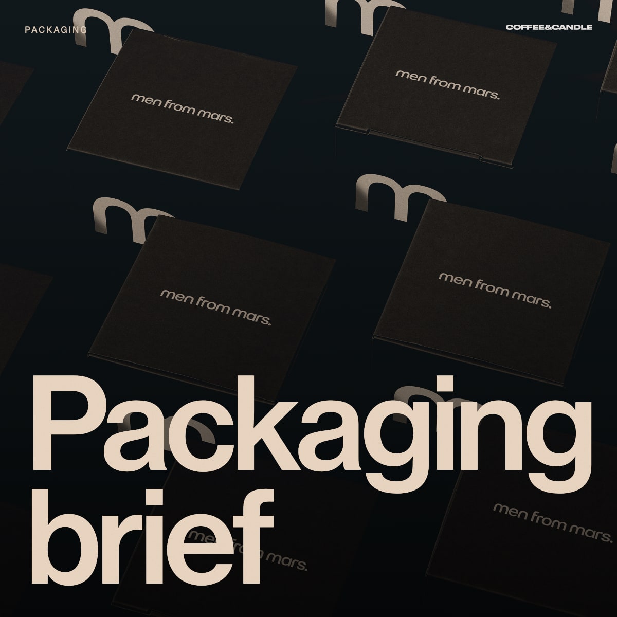
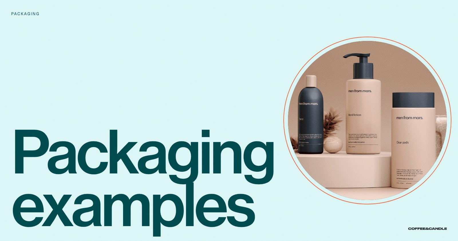
For Men from Mars we built a packaging system around a warm peach and deep navy palette, a lowercase wordmark and a friendly "Hey!" voice. The shipping boxes, bottles and jars share one visual language, so the range reads as a family.
Hestory
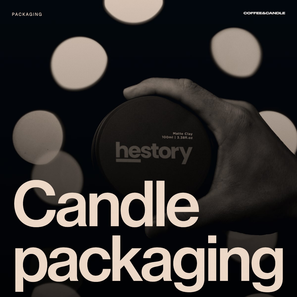
For Hestory the bottles and tins carry a bold orange wordmark on a dark ground, which stands out against the neutral palettes common in grooming.
What to do with this
When you look at packaging you admire, ask:
- What is the first thing I notice?
- How quickly do I understand what it is?
- What does it tell me about price and quality?
- Would I recognise it across a shop?
- How would it look as a small thumbnail online?
Common mistakes in packaging
- Copying a category leader so closely you disappear
- Overloading the front of the pack
- Ignoring how it looks online
- Treating legal text as an afterthought. See our guide to label design.
- Choosing finishes before the structure and brief are right
Frequently asked questions
What makes packaging design good?
It gets noticed, communicates quickly, reflects the brand and does its practical job of protecting and presenting the product.
How can small brands compete with large ones on shelf?
By being more specific. A clear idea, a distinctive colour and a consistent system can outperform a big budget.
Where do I start?
With a clear brief. See our packaging brief template.
Can you design our packaging?
Yes. See our packaging design services, or book a free brand consultation.