 Hestory
 How much does branding cost in the UK?
 Men from Mars
Brand identity
Mailchimp’s 2018 Rebrand: Why One Colour and One Typeface Can Do So Much
Mailchimp’s 2018 identity built a brand around one yellow, one serif typeface and a simplified mascot. What small brands can borrow from the approach.
Mailchimp’s 2018 rebrand showed how far a brand can go with very few ingredients. One bold colour, one distinctive typeface and a simplified mascot gave a sprawling product a single, unmistakable personality.
In this article
What happened
In 2018, Mailchimp unveiled a new identity created by the agency Collins together with its own in-house design team. Creative Review reported the main changes. The colour was Cavendish Yellow, described by Mailchimp as “sunshine and optimism” and used as the single anchor colour, supported by a secondary palette. The typeface was Cooper Light, a design with roots in the 1920s, chosen for a sincere and trustworthy personality. The chimp mascot, Freddie, kept his hat and wink but became a simpler, single-colour silhouette.
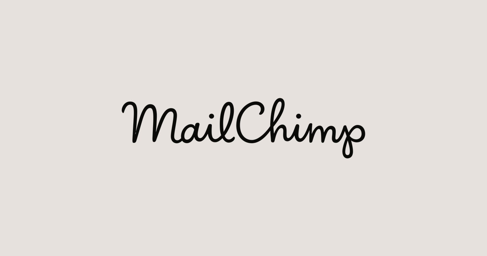
The old script wordmark was replaced by a bold, lower-case sans-serif. Design Week reported Mailchimp’s view that the script and Freddie had hierarchy problems and never appeared together, so the icon wasn’t always recognisable on its own. A group of illustrators created imagery in mostly black and white with yellow accents. Reaction to the wordmark was divided.
Why constraints help
- A single anchor colour is memorable. When one colour appears everywhere, people link it to you quickly.
- A distinctive typeface adds character. Type does as much as colour for personality.
- A simple mascot works at every size. A clean silhouette travels from favicon to billboard.
- Fewer choices mean faster work. Teams spend less time deciding and more time making.
- Consistency compounds. Every use reinforces the last.
Borrowing the approach
- Pick a hero colour. Choose one that’s distinctive in your category and test it against competitors. See our guide to choosing brand colours.
- Choose type with personality. Pair it with a plain text face. Our guide to choosing brand fonts explains how.
- Simplify your symbols. Strip any mark down until it still works small.
- Write the rules down. A one-page brand sheet is enough to start.
- Keep it up. Constraints only work if people stick to them. See brand consistency across channels.


A word of caution
Constraints are strong because they’re bold. A hero colour that blends in with competitors doesn’t help you. Check what the category already uses before you choose, and see our competitor analysis guide.
If you want a brand that’s distinctive and simple to use, book a free brand consultation or see our brand identity agency London page.
Sources
- Freddie gets a facelift in Collins’ Mailchimp rebrand, Creative Review
- ‘Playful’ Mailchimp redesign aims to unify brand while encouraging creativity, Design Week
Cover photo by Joanna Kosinska on Unsplash.