How to Choose Brand Colours: A Practical Guide to Building a Palette That Works
Colour is one of the fastest ways people recognise a brand. Before a customer reads a word, the colour of a pack, a sign or a website has already told them something about quality, personality and category. That makes it a strategic decision, not just a matter of taste.
This guide walks through how to choose brand colours that suit your positioning, stand out from competitors and work in practice.
Start with strategy, not swatches
Pick colours after you know:
- Who the brand is for. Different audiences respond to different cues.
- How you want to be perceived. Premium, friendly, technical, calm and playful call for different palettes.
- What your competitors look like. If everyone in your category uses the same colours, there is room to stand apart.
This work belongs in the strategy stage. See brand strategy versus brand identity for how it fits.
What colours tend to communicate
Colour meaning is cultural and contextual, so treat these as tendencies, not rules:
- Blue often reads as trustworthy and calm, which is why it is common in finance and technology.
- Green is associated with nature, health and growth.
- Red signals energy and urgency.
- Orange feels warm and energetic.
- Black and deep navy suggest sophistication and authority.
- Warm neutrals and peach feel soft and approachable.
- Yellow is optimistic and attention-grabbing.
The context matters more than the label. A warm peach can feel soft in skincare and refined in stationery. What counts is the whole combination.
Build the palette in layers
A working palette has structure.
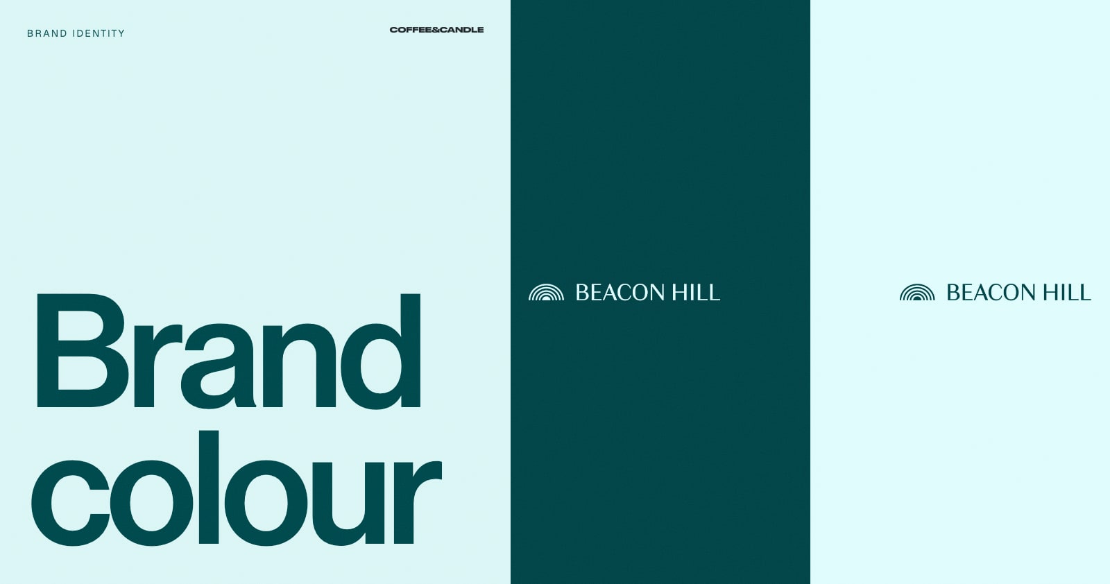
- Primary colour(s). One or two colours people associate with the brand.
- Secondary colours. A few that support the primary for variety.
- Neutrals. Whites, greys, blacks or creams for text and backgrounds.
- Accent. A small, bright colour for calls to action and highlights.
- Functional colours. Success, warning and error states for digital use.
Aim for a small palette. Most strong brands lean on two to four colours with clear proportions, such as "mostly neutral, with the primary in 20 percent of the layout".
Test against competitors
Put your shortlist beside your five nearest competitors on a single page. Ask:
- Can you tell your brand apart at a glance?
- Do you look like a better version of the category, or a copy?
- Would you stand out on a shelf or in a search result?
Make sure it works in practice
A palette that looks good on a mood board can fail in use. Check:
- Contrast and accessibility. Text must be readable against its background. Test combinations against accessibility contrast guidelines, particularly for body text and buttons.
- Screen and print. Colours shift between RGB screens and CMYK print. Define values for both, and test on real printed samples.
- Different surfaces. Check on packaging stock, signage, fabric and dark and light backgrounds.
- Small sizes. Test the logo in your colours at a favicon size.
- Colour blindness. Do not rely on red versus green to carry meaning.
Document the palette
Record each colour with:
- A clear name
- HEX and RGB values for screen
- CMYK and, if needed, Pantone references for print
- Usage rules: proportions, pairings and combinations to avoid
- Accessibility notes
Put it in your brand guidelines so every designer and printer uses the same values.
Common mistakes
- Choosing colours because they are "your favourites"
- Copying a category leader so closely that you disappear
- Using too many colours
- Ignoring print and accessibility
- Following a trend that will date quickly
- Changing the palette without changing the strategy
Frequently asked questions
How many colours should a brand have?
Usually two to four main colours, plus neutrals and a functional set for digital.
Should my brand colours match my industry's norm?
Not necessarily. Familiar colours can signal credibility, but a distinctive choice can make you more memorable. Decide deliberately.
Can I change my brand colours later?
Yes, but it affects recognition. A gradual evolution is safer than a sudden switch unless the business is repositioning.
Can you help us choose?
Yes. It is part of our brand identity work. Book a free brand consultation to talk it through.