Food and Drink Packaging Design: How to Stand Out on a Crowded Shelf
A shopper in a supermarket decides quickly. Many spend only moments in front of a category, and in that time your pack has to be noticed, understood and trusted. Online, the same pack appears as a thumbnail among dozens of others.
Food and drink is one of the most crowded packaging categories, with strong conventions and strict legal requirements. Standing out without breaking the rules is a design problem worth solving carefully.
Understand the category before designing
Photograph the shelf. Notice:
- The dominant colours and where there is space for a different one
- Typical layouts, claims and imagery
- How premium and value products signal their position
- What the best sellers have in common
Conventions exist because customers use them to navigate. Break them deliberately, not accidentally. The research phase in our packaging design process gives a fuller method.
Principles that help packaging work
1. A clear hierarchy
Customers should be able to find, in order: the brand, what the product is, and the key reason to buy. If everything shouts, nothing is heard. Work out what comes first, second and third, and design accordingly.
2. Instantly understand the product
Make sure the pack says what is inside. Flavour cues, imagery, and simple descriptors help, particularly for range products where customers must identify variants quickly.
3. Distinctive colour and shape
Colour is the first thing seen from a distance, and shape is next. A recognisable palette or an unusual format can be more powerful than elaborate illustration. Consistency across the range builds a recognisable block on shelf.
4. Signal quality and price position
Premium products tend to use restraint, quality stocks and finishing. Value products often use bolder colours and clear messaging. Your packaging should match the price you want to charge, or customers will feel a mismatch.
5. Build trust
Food is personal. Cues that reassure include honest descriptions, clear ingredients, credible certifications and appetising, truthful imagery. Avoid claims you cannot support.
6. Design for the range
Plan how new flavours and sizes will fit. A flexible system allows fast launches without redesign and keeps the brand block coherent.
7. Think about how it looks online
Check how the front of pack appears at thumbnail size, and how it photographs. Many food purchases are now made from a phone, so legibility at small size matters.
Legal requirements: design with them, not around them
Food and drink labels must include certain information, which can include a name, ingredients, allergens, weights or volumes, date marks, storage conditions, nutritional information and business details. Some products have additional rules, such as those on alcohol or health claims.
Requirements vary by product and change over time, so check the latest guidance from the Food Standards Agency and your local Trading Standards service, or use a labelling specialist. Build the mandatory information into the layout from the start to avoid cramped, compromised designs.
Sustainability
Many food and drink customers look for responsible packaging. Choose materials that can be recycled where your customers live, and communicate honestly. See sustainable packaging design in the UK.
Packaging for small and emerging brands
Newer brands often have smaller budgets and minimum order quantities. Options that help:
- Start with a smaller range and expand
- Use standard formats with distinctive graphics
- Invest in colour, typography and a strong logo before costly finishes
- Order proofs and short runs to test before large quantities
A clear brief saves money.
Mistakes to avoid
- Copying the category leader so closely that you disappear
- Overloading the front with claims
- Using tiny text for essential information
- Designing only for print, with no consideration for screens
- Ignoring production limits on ink, finish and structure
- Forgetting accessibility, such as contrast and readability
Connecting packaging and brand
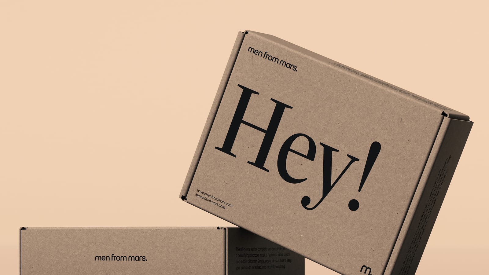
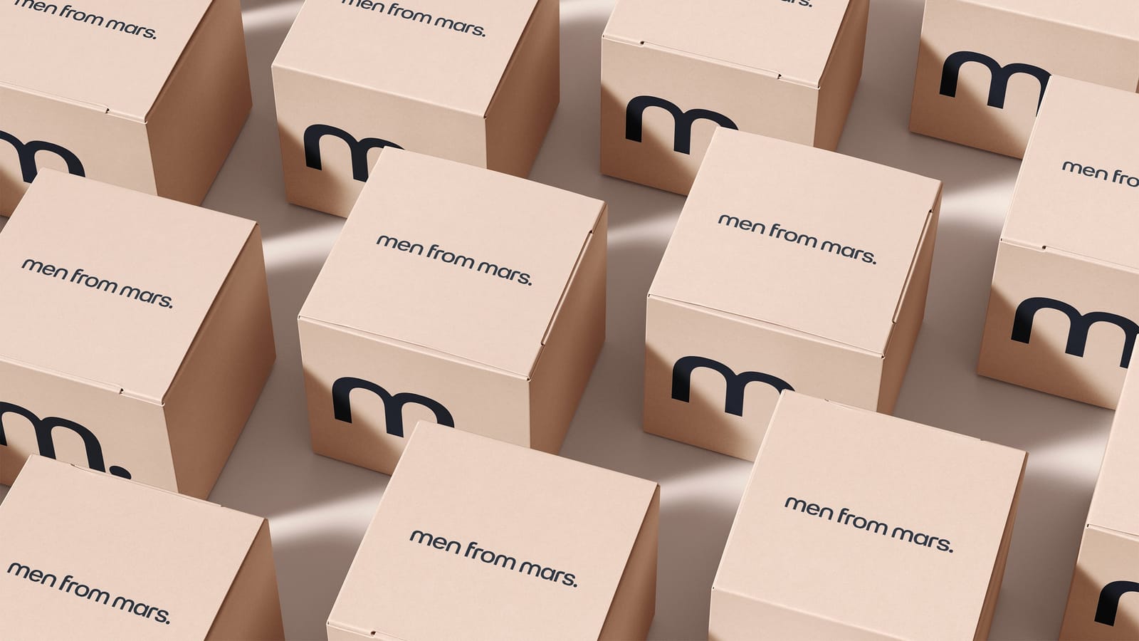
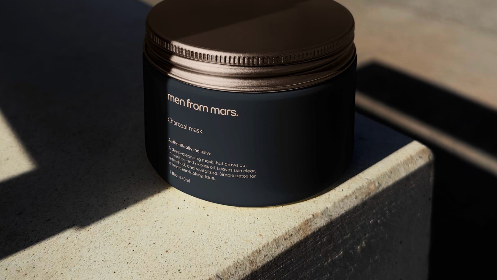
Packaging should look like part of a wider brand, not an isolated object. The same personality should appear on the website, social media and any physical retail. Our brand identity work ensures that the identity carries across touchpoints, as in our Men from Mars project.
Frequently asked questions
How important is packaging to sales?
For many food and drink products, it is one of the most influential factors, particularly for impulse and new product purchases.
Should I use photography or illustration?
Either can work. Choose the one that fits your brand and supports clarity and appetite appeal. Test at small sizes.
How often should packaging change?
Only when it improves performance or the brand evolves. Frequent changes can confuse regular customers.
Can you help us design food or drink packaging?
Yes. Book a free brand consultation to discuss it.