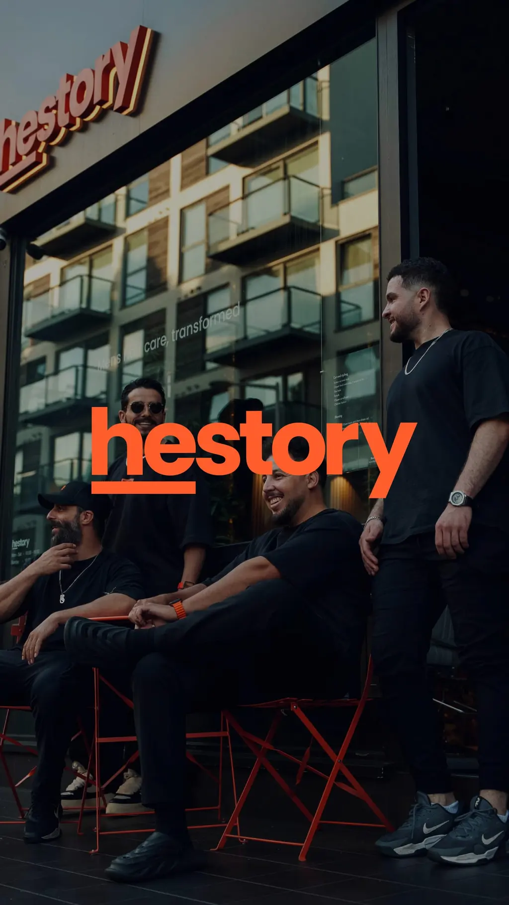
 Hestory
 How much does branding cost in the UK?
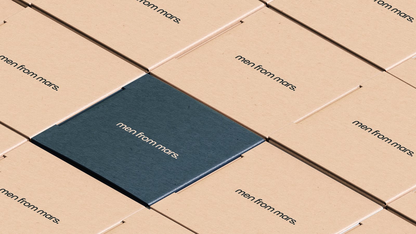
 Men from Mars
News
Apple Music’s New Logo Was Made With Sound and a Pool of Oil
Apple Music has its first rebrand since 2015: a lowercase wordmark and a wave pattern made by passing sound through oil. How it was built and why it matters.
Apple Music has a new logo, and it was made physically. The first rebrand since the service launched in 2015 uses a wave pattern created by passing sound through a shallow pool of oil.
What happened
Dezeen reported on 26 October that the logo overlay was made by sending sound through mineral oil with a transducer. The wordmark is a custom version of Apple’s SF Pro in bold, all lowercase, so the M in “music” is now lowercase beside the Apple icon. Apple also revealed a musical note icon. The musician Fred Again collaborated on the sound, working with the studio NEST Acoustics.
It’s Nice That adds more detail on 28 October: the identity was created with the agency TBWA\Media Arts Lab, and production studio Optical Arts built the oil apparatus. The identity is mostly black and white, moving away from the bright pinkish red, with colour coming from the oil’s prismatic effects. It reports six or seven ripple variations tied to features such as AutoMix, Spatial Audio and Lossless Audio, built from more than a hundred individually shot frames over roughly eight to ten weeks of research and development.
We covered the first reaction to the black-and-white icon earlier in October: Apple Music’s new black-and-white icon draws backlash.
Why it matters
The identity does something rare: it makes the brand idea physical. A rebrand about sound is built from sound, so the story and the method are the same thing. That gives people something to talk about beyond the logo.
What it means for your brand
- Make the method part of the story. How a thing is made can be the most memorable part. See how to create a brand identity.
- Build a system, not a single mark. The variations tied to features show a flexible identity. Our brand identity work covers the full system.
- Test before you launch. Early reaction to the icon was negative. Read how to test a rebrand before you launch.
Cover photo by Lee Campbell on Unsplash.