
 Hestory
 How much does branding cost in the UK?
 Men from Mars
News
Apple Music's New Black-and-White Icon Draws Backlash
Apple is testing a black-and-white Apple Music icon and many people dislike it. What happened, and what it teaches about changing familiar brand assets.
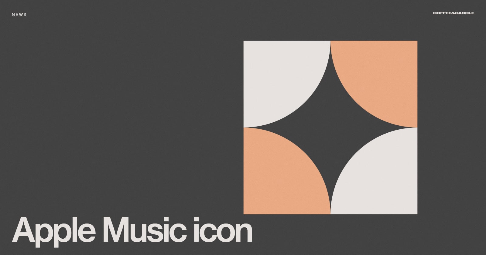
A new black-and-white Apple Music icon has appeared in iOS and macOS beta builds, and the reaction online has been largely negative. Apple hasn't confirmed a formal rebrand, but the change is a useful reminder of how people react when a familiar brand asset suddenly looks different.
In this article
What happened
MacRumors reported on 6 October that the new icon appeared in the second 27.2 beta releases and matches the one Apple used in an Apple Music announcement the month before. Apple hasn't announced a global rebrand.
Engadget reports that the new icon replaces a 13-year-old red design with a beamed eighth note, and that comments online included "boring" and "generic". Some people argued the black and white suits sheet music, but the dominant response was disappointment.
Why the reaction is so strong
Familiarity is an asset. People had spent over a decade learning the red icon. When a recognisable shape or colour changes, it can feel like a loss, even if the new design is clean.
Colour does a lot of work. Red made the app stand out on a crowded home screen. Black and white is more neutral, which can feel safer but less distinctive.
It's a beta. Final decisions may differ. The reaction is a useful early signal either way.
What it means for your brand
- Test before you launch. Show a new logo to real customers before you commit. See our guide on how to test a rebrand before you launch.
- Know what people recognise. Before changing anything, work out which cues carry recognition: colour, shape, name or sound. Keep those unless you have a strong reason.
- Neutral isn't always better. Simplifying can remove the personality that made you memorable.
- Explain the change. If you do change something, say why. People accept change more easily when they understand the reasoning.
The bigger lesson
Big companies can survive a negative first reaction. A small business has less room. If you're considering a refresh, aim for evolution over a complete break, and make sure the new look is at least as distinctive as the old one. Our guide to rebranding ideas sets out options from a light refresh to a full rebrand.
Not sure whether your brand needs to change? Talk to us.