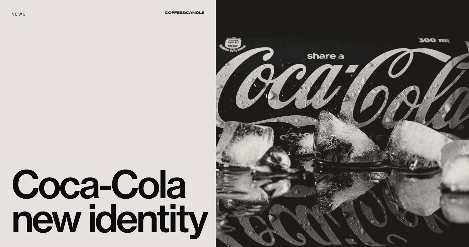
Coca-Cola's New Global Identity: A System, Not a New Logo
Coca-Cola unveiled a new global visual identity in July 2026, and the headline is what it did not do: it did not introduce a new logo. Instead, the company has sharpened the assets it already owns and built a system to apply them consistently in more than 200 markets.
What was announced
According to Creative Review, the identity was led by the agency JKR. Other studios worked on the packaging system (The Superultrarare), a proprietary typeface (Brody Associates) and a digital Brand Center for teams and agencies who use the system. New image standards were set by three photographers.
The core assets stay: the red-and-white palette, the Spencerian script, the Dynamic Ribbon and the Arden Square. Coca-Cola Zero Sugar gets larger "Zero Sugar" typography, a more prominent black Dynamic Ribbon on cans and black bottle caps on PET packaging. The new look is rolling out across Latin America, Europe, the Middle East and Asia.
"The operating system, not every application"
Rapha Abreu, global vice president of design at The Coca-Cola Company, described the aim as a stronger system rather than a rigid one, and the work as "designing the operating system rather than every application". He also said creating the visual identity "was only half the work", with implementation the other half. Local markets keep flexibility over photography, messaging, partnerships and cultural activations.
Why it matters beyond Coca-Cola
You do not need a global drinks company's budget to apply the same thinking.
- Use the assets you already own. Distinctive colours, shapes and type are worth more the longer they are used. Our guide to brand consistency across channels explains why.
- Build a system, not a logo. A logo is one asset. A brand needs rules for colour, type, imagery, layout and tone. See brand guidelines: what to include.
- Plan implementation from day one. A well-designed identity that nobody can apply correctly will drift. Guidelines, templates and tools are part of the work.
- Leave room for local judgement. Fixed rules where it matters, flexibility where it helps. Our brand guidelines examples show where others draw the line.
Not every refresh needs a new logo
When people talk about a rebrand, they often mean a new logo. Often the better answer is a clearer system around what already works. If you are not sure which you need, read signs your business needs a rebrand, or book a free brand consultation and we will give you an honest view.
Source
Cover photo by Lufefe Ngilana on Unsplash.